The chart below shows the employment rates across 6 countries in 1995 and 2005.
Summarize the information by choosing and describe the main idea, and make comparisons where appropriate. (Study Sample)
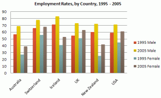
The graph shows changes in employment rates in six countries between 1995 and 2005, for men and women.
Overall more and more people of working age are employed, and there have been significant improvements for women, although they leg behind men in entering the workforce.
The most obvious trend in the graph is that women have lower employment rates in most of the countries in the graph. For example, in Australia in 1995, 57 percent of men could find work or retain a job, but only 27 percent of women. The difference was even bigger in New Zealand, with 60 percent of women. Even in Switzerland and Iceland, a lightly more men than women were in the job market.
The second biggest trend in the graph is the improvement in employment between 1995 and 2005. In all countries shown, figures for both men and women improved. The biggest change was in the United Kingdom, from 55 percent of men in 1995 to 73 percent over the ten years period.
Furthermore, the increases in employment rates for women were much higher in New Zealand. The percentage of working women jumped from 25 percent to 42 percent, and in the United States from 45 percent to 61 percent over the decade.
In conclusion, all the countries in the graph showed at least a 12 percent increase in employment rates of both men and women over the ten years. While men had relatively higher employment rate throughout the period, more and more women appear to be entering the labour market.

flaws:
Sentence Length SD: 5.25 7.5
Number of Paragraphs: 6 4
better to have 4 paragraphs:
para 1: introduction
para 2: body 1
para 3: body 2
para 4: conclusion
sample:
http://www.testbig.com/ielts-essays/qthe-graph-below-shows-different-mo…
http://www.testbig.com/ielts-essays/graph-below-gives-information-about…
http://www.testbig.com/ielts-essays/charts-below-show-uk-and-usa-energy…
http://www.testbig.com/ielts-essays/cheart-below-shows-information-abou…
or
para 1: introduction
para 2: conclusion
para 3: body 1
para 4: body 2
sample:
http://www.testbig.com/ielts-essays/climograph-below-shows-average-mont…
http://www.testbig.com/ielts-essays/graphs-below-show-types-music-album…
http://www.testbig.com/ielts-essays/table-below-gives-information-about…
Attribute Value Ideal
Score: 7.5 out of 9
Category: Very Good Excellent
No. of Grammatical Errors: 0 2
No. of Spelling Errors: 0 2
No. of Sentences: 13 10
No. of Words: 257 200
No. of Characters: 1169 1000
No. of Different Words: 118 100
Fourth Root of Number of Words: 4.004 4.0
Average Word Length: 4.549 4.6
Word Length SD: 2.399 2.4
No. of Words greater than 5 chars: 75 60
No. of Words greater than 6 chars: 55 50
No. of Words greater than 7 chars: 29 40
No. of Words greater than 8 chars: 23 20
Use of Passive Voice (%): 0 0
Avg. Sentence Length: 19.769 21.0
Sentence Length SD: 5.25 7.5
Use of Discourse Markers (%): 0.385 0.12
Sentence-Text Coherence: 0.434 0.35
Sentence-Para Coherence: 0.687 0.50
Sentence-Sentence Coherence: 0.078 0.07
Number of Paragraphs: 6 4