The line graph below shows the changes in the share price of Outokumpu companies in euros between January 2006 and December 2010.
Summarise the information by selecting and reporting the main features, and make comparisons where relevant.
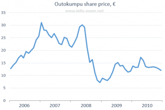
The line graph below provides the transformation in the share price of Outokumpu organizations in euros from January 2006 to December 2010.
The share price started at around EUR 13 in 2006. There were several fluctuations from 2006 to 2007 until it reached a peak of around EUR 31 in 2007. Eventhough, there was slight degradation from 2007 until the mid-term and it reached around 21 EUR the graph rose again until reached the point of EUR 30 in 2008. Suddenly, the graph falls dramatically from EUR 30 in 2008 to around 7 EUR in late 2008. After that, the graph had slow improvement and reached 15 EUR in 2009, it keeps fluctuate until the end of 2010 and finally reached approximately 12 EUR in the last-term of 2010.
Overall, it can be seen that in the first-term of the graph the share price always had dramatic improvement, while in second-term it decreased dramatically and had lots of fluctuations
