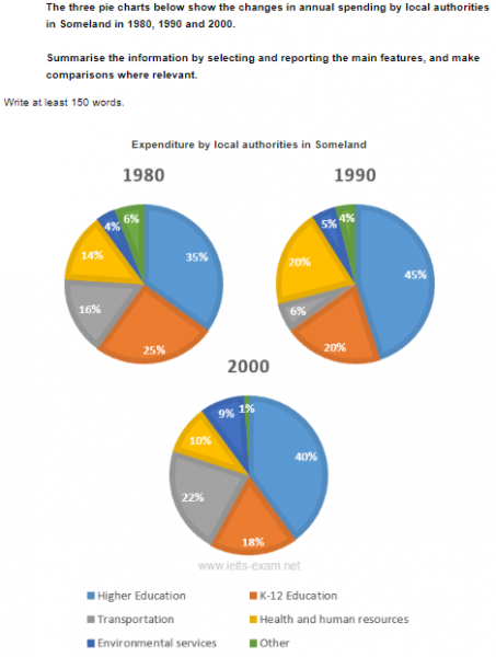
The three pie charts below show the changes in annual spending by local authorities in Someland in 1980, 1990 and 2000.
Summarise the information by selecting and reporting the main features, and make comparisons where relevant.
The three pie charts represent the variation in yearly spending in someland by local authorities in the year 1980,1990 and 2000.
Overall, a significant amount of money was spent on higher education followed by k-12 education in the recorded years. Contrary to this, the least expenditure was on environmental and other services.
In 1980, expenditure was 35% on higher education, which increased by 10% in 1990 and finally, accounted for 40% in the year 2000. Amount of money spent on k-12 education decreased over the years, it dropped from 25% in 1980 to 20% in 1990 and by the end of 2000, it was 18%.
A considerable amount of money was spent on transportation which accounted for 16%, but it plummeted to just 6% in 1990. Surprisingly, it rose rapidly to 22% in 2000. Expenditure on health and human resources fluctuated from 14% in 1980 to 10% in 2000. Environmental and other services accounted for 10% combinedly, in 1980 and 2000. Also, it was just under 10% in 1990.