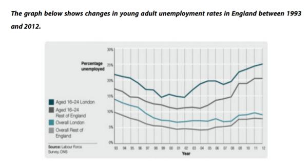
the line graph compares levels of unemployment among 16 to 24-years-olds with overall unemployment figures from 1993 to 2012 in England.
Overall; the unemployment ratio was significantly higher for the youth than for the general adults in both london and the rest of England during the 20-year period. And the joblessness in London are more popular than that in the rest of the UK.
In 1993, around 22% of young adults in London were unemployed, after falling to under 15% in 2002, this figure then increased significantly and reached a peak at exactly 25% by 2012. In contrast, there was a decline in the overall unemployment ratio in London from under 15% in 1993 to just about 7% in 2006, although after that this figure rose slightly, it just remained under 10% in 2012.
Similarly, in 1993, the percentage of unemployment among young Labour in the rest of England was approximately 17% , after decreasing to about 11% in 2002, this figure then rose dramatically and by 2012, it peaked at over 20%. Otherwise, there was an downward trend in the general joblessness rate in outer London from exactly 10% in 1993 to just under 5% in 2005, despite minor growths it still remained below 10% by 2012.
Can i ask somthing, im new.
Can i ask somthing, im new. IS this a PROFESSIONAL website like essayforum.com, i mean i dont see many experts around here and give useful advice :) ( Just afk :D )
It is different to essayforum
It is different to essayforum. Essays in testbig are evaluated mainly by e-graders using AI technologies.
I think it deserves 6.5 to 7.0 out of 9